Focus More
Helps people focus on tasks that matter.
I worked on the Focus More project as part of the Udacity's UX design nanodegree program. The core idea behind the project was to design a productivity application using design thinking principles.
Through user experience research I was able to understand the user needs, after which I worked on generating a broad set of ideas to solve this productivity issue. A high-fidelity prototype was designed based on the ideas that came out of the ideation session and it was later tested for usability, the results of which are explained later below.
The Challenge
Many of us are connected online for work or educational purposes; it is easy to get sidetracked from work due to distracting applications like facebook, twitter and messenger to name a few.
Research shows that the brain requires 23 minutes to refocus each time it gets distracted. Giving in to distractions is habit-forming and this product is built to break the habit.
There are many distraction blocker apps available in the app store, then the question became:
How are people using distraction blocking apps?
How we might make this process more efficient for people to stay focused longer?
Discovery
My first task was to identify the specific problems the users were facing in their current focus management process and then optimize the application to solve the core problems.
User interview participants were recruited through an online survey.
Participants selected included people who regularly accessed the internet for work or education purposes and got sidetracked on one or more occasions while working on important tasks.
I conducted a series of exploratory interviews with 6 users to understand the context and their pain points. These conversations unveiled many pain points, of which I prioritized user needs and focused on the features that needed to be implemented for the MVP.
I asked them questions about:
Work environment
How, why and when distraction occurs
Feelings about other apps
Other factors helping them focus
Key Findings
4 out of 6 research participants said that Notifications on their mobile phone was the main reason for getting distracted from work.

Illustration from blush design

Illustration from blush design
Simply remembering the deadline or their goal prevented them from giving in to distractions.
Time tracker apps were overwhelming because sometimes it rang the alarm when they were focusing deeply. They often found it difficult to focus as it made them anxious wondering when the alarm would go off.

Illustration from blush design

Illustration from blush design
Website blockers gave them access easily when they wanted to unblock.
Ideation
Feature ideation and prioritization
The findings were arranged according to the value and complexity.
4 key features were prioritized to implement first.


Design
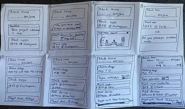
Paper sketches
I designed a mock-up and prototyped a mobile app in order to minimize risk and prove the concept quickly.

Low Fidelity Prototype


Usability testing session 1:
Moderated remote usability testing sessions were conducted with few participants. The purpose of the test was to build a product that worked for real users. They were encouraged to think aloud to capture their overarching thoughts and impressions.
Below are some of the tasks that I prompted them to do during the interview to simulate the real-world experience.
"Let’s say you are new to the app and want to sign up. What would you do?"
"Let’s say you want to avoid distractions for a particular time frame during the day. What would you do?"
"Let’s say you want to block few applications. What would you do?"
"Let’s say you have logged in as a user, How would you log out?"
Outcomes of usability testing session
Low Fidelity Prototype testing revealed that many users struggled with the steep learning curve, citing issues with the length of the form and intuitiveness.
The users expressed that:
“It could have been in a wizard format with a next and back button on each screen.”
“I would like to check out the app first before I could register.”
“A summary page will be helpful and also an option to edit my selections”.
High Fidelity Prototype
.png)
1. Landing Page
Here, people new to the app can signup and returning users can login. Users who just want to check out the application can skip the sign up process and see what the Focus More application has to offer.
2. Block apps
People can choose applications that they want to block notifications from. They can also enable the app on all devices that have Focus More installed.


3. Set timer
Here, people can select a time slot to block notifications.
4. Selected Devices
Here, people can select devices on which they want to turn off notifications.


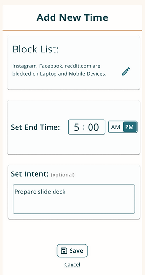
5. Set Intent
Here, people can customize the sessions end time and set intentions to help with motivation.
6. Home Page
The home page displays the summary and also the time left to the end of the current session.

Accessiblity
I wanted to create a an app that was accessible. The colors used, complied with WCAG AAA standard for color contrast ratios.
Colors & Font
Teal
#276F7D
Bottle Green
#18464E
Text Color
#FCFDFD
Orange
#C96916
Open Sans
Almost before we knew it, we had left the ground.
Almost before we knew it, we had left the ground.
Almost before we knew it, we had left the ground.
Usability testing session 2:
10 people participated in the unmoderated remote usability testing study. Lookback.io was used for this session. The purpose of the test was to see how the potential user would use the product in their own environment.
Usability assessment: 90% of the participants on lookback.io completed all tasks and were able to understand what each task was about.
Many users struggled with navigating from "Block Apps" to "Devices" because the login screen took them directly to the "Set Timer" screen and the "Confirm" button took them directly to the "Block Apps" screen. They had not used the navigation until then. Once they figured that out, it was easy to get to the next selection. I found that little tweaks in design resonated with users.
Future Improvements
My main takeaway here is to involve users in every step of the design. It was truly amazing to see how impactful it was to involve the users through each step of the design process. What seems intuitive to designers is not necessarily so for the users.
I believe that there is still room for improvement for Focus More. The main goal of this project was to block distractions so that people could spend time on the tasks they set out to do. It is important to reiterate key features of the application before adding new features. That said, improving on accessibility and voice integration could be future visions for this product.